


common assets, vol. 4
it’s that time again. this year marks the 10th trip ‘round since moving out here; though, i haven’t spent nearly as much time calling this place home. it’s been… a journey. still is, too. and with reflection on the menu tonight, thought i’d go over some of the specials.
here goes…

‘SOUR’ - Olivia Rodrigo (2021/Geffen Records)

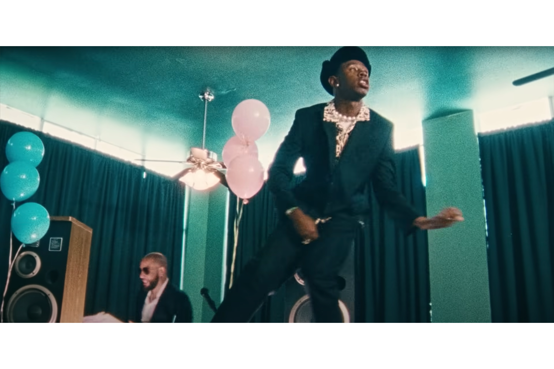
“LAW OF AVERAGES” - Vince Staples (2021/UMG) directed by Kid Studio
dig this.

‘Call Me If You Get Lost’ - Tyler, The Creator (2021/Columbia Records)
SWEET / I THOUGHT YOU WANTED TO DANCE … sheeesh!
“Corso” - Tyler, The Creator (2021/Columbia Records) directed by Wolf Haley, aka Tyler Baudelaire, aka Bunny Hop, aka The Creator; cinematography/DP by Luis Perez
favorite video from the rollout.
experiencing a streak of luck with neighborhood “free stuff” offerings. some finds from yesterday, and this afternoon:

‘Five Hundred Self-Portraits’ - Julian Bell (2004/Phaidon Press)

‘Over and Over: A Catalog of Hand-Drawn Patterns’ - Michael Perry (2008/Princeton Architectural Press)

‘The Art Quilt’ - Robert Shaw (1997/Beaux Arts Editions)

trio of KOH-I-NOOR stencils from a free pile i passed on my walk home today.

“landscape template”

“isometric ellipse template”

“architectural symbol template”

Youtube started suggesting these S&S Horseshoeing videos and, long story short, i’m hooked. well timed too, following a farrier focused crossword clue from a week or so ago.
anyhow, i really like Sheldon’s videos and learning what farriers do.

some lick-em horseshoe stamps a pen friend included in a recent letter. i mean, c’mon… !
Valida’s 06/27 KCRW set (thanks for the intro, Sam!)
some of the stickier tracks i heard:

‘Program Tvog Kompjutera” - Denis & Denis (2019/Croatia Records)

“Will You Be?” - Baltra (2021/Local Action Records)

“Ani Kuni” - Polo & Pan (2021/Hamburger Records)
and remember…
it’s OK to feel good.

hall monitor
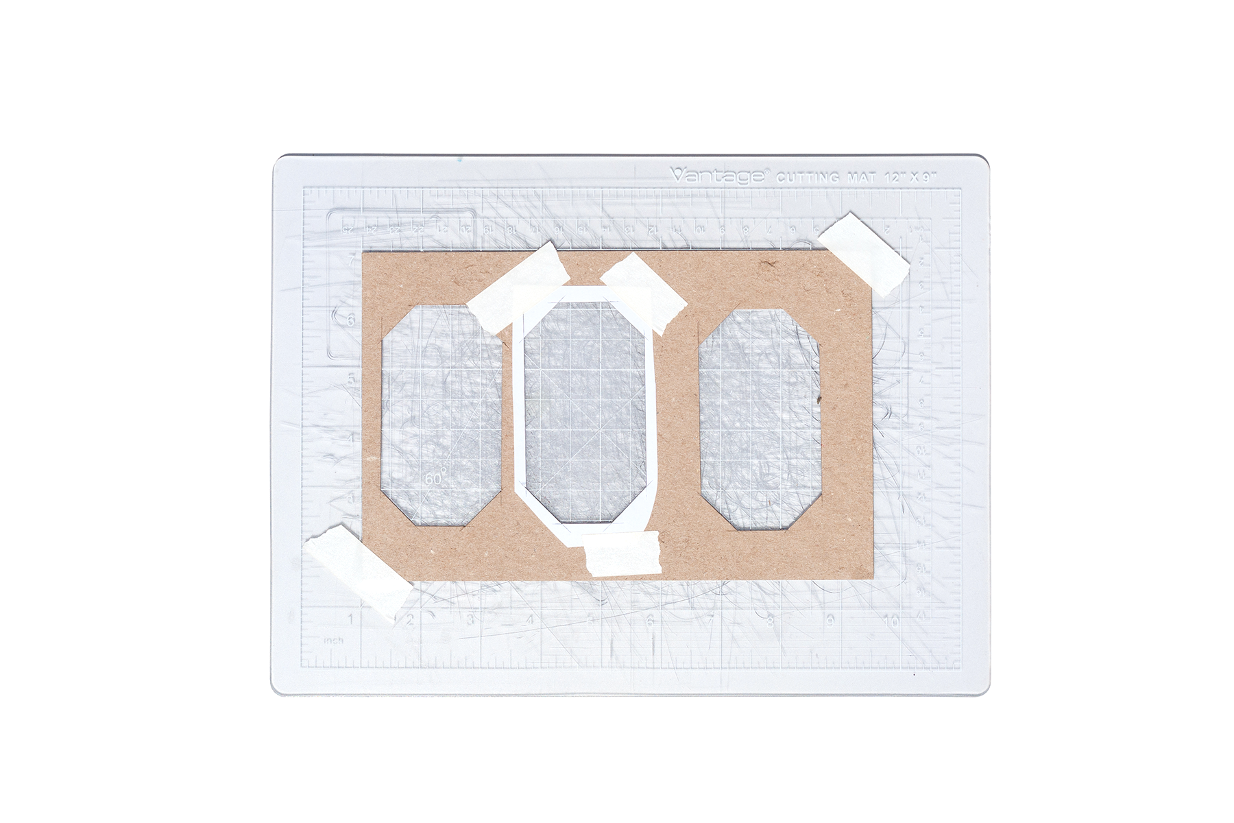
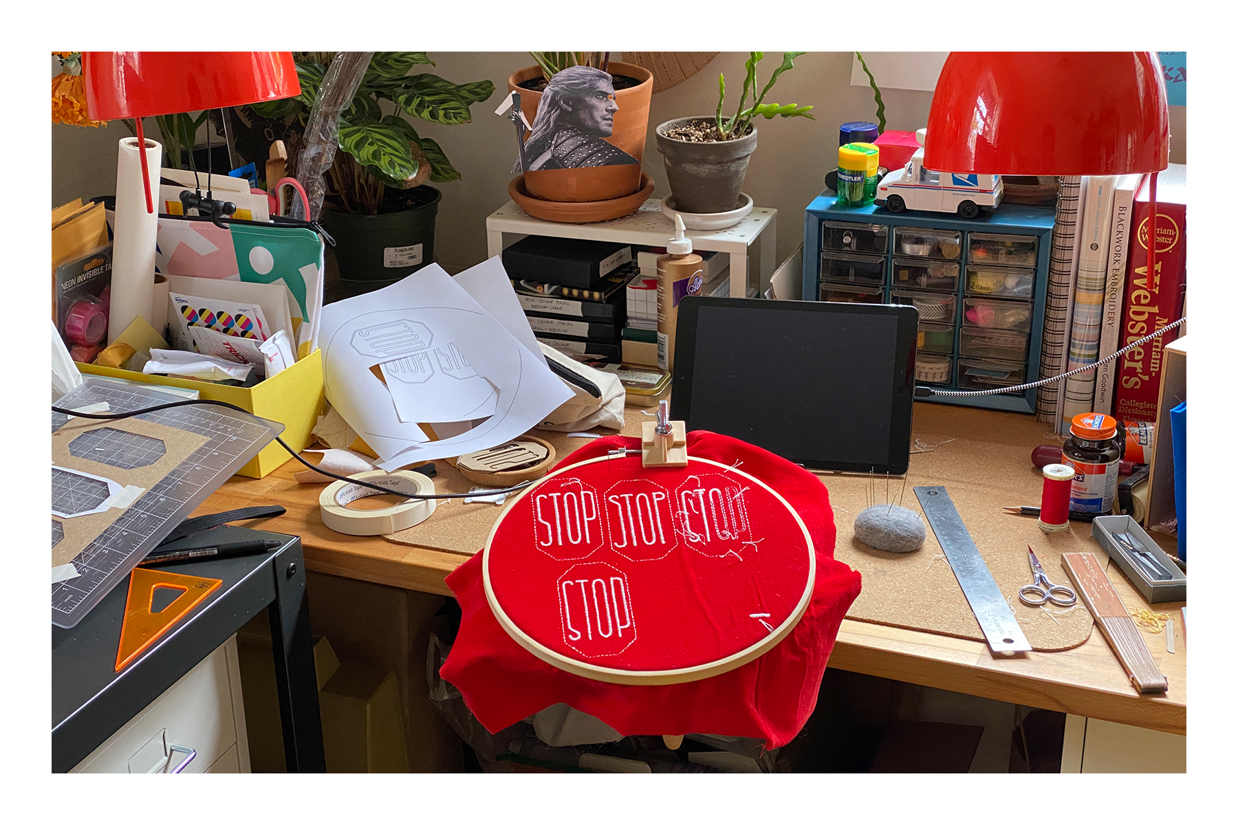
rounding up some stragglers… like the stop sign patches.
kept it simple, but had some challenges with design transfer. given the circumstances, using stencils worked really well.

picked up some red velveteen fabric from “the depot” (aka “garbage arts”) and added fusible stabilizer for structure.
transferring the design to the velveteen pile was a no-go (tried it… was a mess). instead, traced the reversed design onto the stabilizer. stitched outlines in stem stitch from the wrong side, which gave me outlines in back stitch from the right side – bingo.
4-way stop pooty-hoop
revisiting process photos reminded me that i watched all of ‘BoJack Horseman’ while working on these earlier this year – woof…
i also spy my hand fan, which i lost somewhere along my walk to work last Saturday. bummed. it was one of my most favorite shapes.

the webby bits leading back to anchor knots look neat. those knots are temporary though and get cut away in the end.

one, two, three, and four. farthest right is the prototype. lives on my jacket now – left shoulder.

so happy with the velveteen. it does shed, though.
lint rolling the edges before adding the border cut down on fluff everywhere, gunking up the stitches. ended up with a little sticker monster at the end, too.

edges all finished. backside view, before getting tagged.

hand-sewn polyester ribbon tags. fussy, sure – but i enjoy it.

thread glyphs on the backside – an unexpected delight.

“hall monitor” lookin’ ass…

nice, nice, nice
finished these in May. sorta feel like i’ve neglected processing them – didn’t mean to.
feel that way about a few things in the queue and i’m doing my best to maintain, and sometimes regain, momentum.
i don’t have a segue, but this and this are mixes that came together last week. leaving some evidence of them somewhere instead of waiting for… i don’t know! so, there they are!
ok, bye bye!

status update

status update on "762" (aka kitchen door curtain panel): finished blanket stitch along the vertical edges.

used DMC size 8 pearl cotton in topaz with Tulip big eye straight thin size Sashiko needle for these Sashiko-inspired stitches.


sketching to document and ideate – no set orientation yet. originally imagined the vertical yellow stitches as an edge-to-edge field, but that may be relentless… got seven vertical lines of topaz stitches in so far. leaving that area as is, for now.
picked plum and antique blue pearl cotton from my stash to start stitching with next. they compliment the topaz stitches and silver-gray fabric pretty well. yeah, i like that. onward!

DMC size 8 pearl cotton in plum (718) and topaz (725), and smaller size 12 pearl cotton in medium antique blue (931)
listened to the back half of this for the first time this morning. woof… thought i oughta save it here.
swapped the order of two songs on DO NOT ENTER, too. listened to it during my shift today – feels better…
ok, bye bye!

stardust

“Music Sounds Better with You” - Stardust (1998/Roulé) directed by Michel Gondry
landed here yesterday after watching Gaspard Augé’s ‘Captain’ video on Youtube – such a delight.


tektite

Tibetan Indochinite – a birthday gift from my close friend.
as i’ve come to understand, tektite is a result of interstellar objects like meteors, asteroids, and comets colliding with Earth millions of years ago. the impacts ejected superheated terrestrial material which quickly cooled into glassy tektite as it returned to Earth’s surface. so f--king cool!
tek•tite \ˈtek-ˌtīt\ n [ISV, fr. Gk tēktos molten, fr. tēkein to melt – more at THAW] (1909) : a glassy body of probably meteoritic origin and of rounded but indefinite shape – tek•tit•ic \tek-ˈti-tik\ adj
Merriam Webster’s Collegiate Dictionary, 11th Edition

762


58” wide tweed from Joann Fabrics – i like the silvery color and larger weave.

wanted the stitch detailing to fade away and picked a few colors i thought might do the trick: ecru, 762 “very light pale gray”, and white DMC stranded embroidery floss.

(from left using 3 strands of floss in white, ecru, and 726)
using blanket stitch at the vertical edges of the panel to prevent fraying and reduce bulk. 726 blended the best in different light conditions.

(top “right side”, “wrong side” below)
continued with 762 to test stitch detailing ideas. tried options that show only on one side, and a traditional blanket stitch that shows on both. i like the “both sides” approach best. keeping even tension is easier, and it’s nice to have the stitch detail face inside and out.

fabric is trimmed down and thread color selected. wish i could have kept the selvedge with its lovely tufts, but i’m holding on to some for test strips and maybe something fun later? who knows.

slow down

mini warning sign pin process images, clockwise from upper left. started with scrap piece of yellow linen with stabilizer, stiffened black felt, and butterfly clutch pin-back. used silk to embroider a single interior line and border. glued the warning sign top to the felt back concealing pin hardware between and held in place with wonder clips while glue set. once the glue dried, it was on the jacket and out on the town.
little warning sign pin – a reminder to slow down. have had this one in the wings for a little while. taking time to reflect on the spirit of ongoing projects, and remembering that slowing down is ok – another part of the process.

violation

“What we got here, is a failure to communicate!”
- Luke Jackson, ‘Cool Hand Luke’
that about sums up the last few weeks. f-ck, man…

‘Cool Hand Luke’ - (1967/Warner Brothers) directed by Stuart Rosenberg, screenplay by Donn Pearce and Frank R. Pierson, cinematography by Conrad Hall, music by Lalo Schifrin
based on ‘Cool Hand Luke’ by Donn Pearce
getting back to watching movies – feel like i’ve got the headroom for it these days. feels good. i’ve missed this – steadies and first dates alike.
watched ‘Cool Hand Luke’ for the first time last night, and re-watched ‘Jackie Brown’ a few nights back. before that, had my first go with ‘Revolutionary Road’ and ‘Brokeback Mountain’.

‘Jackie Brown’ - (1997/Miramax Films) directed by Quentin Tarantino, screenplay by Quentin Tarantino, cinematography by Guillermo Navarro
based on ‘Rum Punch’ by Elmore Leonard
“I can’t blame anybody for anything I do.”
- Max Cherry, ‘Jackie Brown’
i mean, where’s the lie?!
‘…Luke’ and ‘Jackie…’ and those before reflected several uncanny parallels to the current state of things. kinda spooky how that works out sometimes.
separate from the movies but riding the same line of thought, gonna keep this mixtape here – only seems right. otherwise it may get lost in the shuffle (no pun intended…).
trusting the process, trusting myself – i’ve got good guts – and making every effort to be here in this moment, and then the next, and whatever may come after.

‘heaven & earth’ mixtape cover


day one

‘Back to Black’ - Amy Winehouse (2006/Island Records) design by Alex Hutchinson, photography by Mischa Richter
trying to reflect on recent experiences and feeling rusty. it’s been a while and the words aren’t coming out right, but i need to process things in order to move forward. making peace with a sh-tshow of a week closing out May, and welcoming in something new. today was the first day at a new job – day one. in the lead up i’ve felt excited (and nervous!), which was nearly toppled by an unexpected cascade of emotion and conflict. it’s been a doozy… (note to future-self: more nuanced reflections have been recorded elsewhere)
project progress over the last month has come in starts and fits. put together a couple mixtapes earlier on that gave me some confidence, and then hit a wall. it was a bummer. felt like i’d been in the pocket, music-listening wise, and then i wasn’t. on top of previous feelings of being sidelined, i was f--king frustrated.
took a break and got back on the horse arranging songs that’d come over the alarm clock radio first thing in the morning. some played as the radio faded on at 7:30 am; others followed in the moments after while i debated whether to get up or stay in bed a little longer. only condition was the tracks be played via alarm activation. did’t take long for them to gel, but they weren’t quite right over several iterations. felt like i was hitting a wall again until deciding to just flip the whole thing and play the sequence in reverse. ta-da.
called this one ‘snoozy’ on behalf of the material and as a cheeky reminder that the “snooze” button on our alarm clock doesn’t actually work…!

sunrise inspired gradient iterations scattered about the Illustrator workspace. been using a heavy magenta boundary to indicate which iteration i like.
the stuff to the far right was fun – maybe it’ll come back later.
had ideas for the cover inspired by themes of morning and sunrise and started iterating in Illustrator. i like the way the sky is represented in Steven Universe – wanted to use those environments as reference, but quickly ditched the idea of illustrating clouds (or, rather, saved for a later date) and focused on a simple color gradient.
listened to the mix while working on the design and took a moment to investigate a sample used in Vince Staples’ ‘Alyssa Interlude’. learning it was Amy Winehouse catapulted me back to her album ‘Back to Black’, and what an experience that trip was given yesterday’s emotional environment and what lead to it. afterward, i knew i had to leave breadcrumbs back. couldn’t allow myself sleep on Amy’s work again.
fussed with gradients a little more when i felt the tension of frustration creeping in. after pivoting in a completely different direction in a desperate search for something (see lower right of Illustrator workspace), decided to apply the same approach i’d used when feeling frustrated with the sequencing: flip it around. bingo.

‘On Sunset’ - Paul Weller (2020/Polydor) design by Alex Hutchinson

blend modes and overlay experiments in Photoshop – lots more options than Illustrator.
efforts to memorialize my experience listening to Amy’s music began by doing the rounds on Discogs and the like for album liner notes and creative credits. found the designer and the photographer – bing, bang, boom. on my way through graphic designer Alex Hutchinson’s portfolio i saw the cover he designed for Paul Weller’s ‘On Sunset’ and thought, “you’ve gotta be f--king kidding me… come through tangential turbo boost!”
up to that point i’d been hung up on the cover design and where to take the graphics. seeing some of my ideas reflected in Hutchinson’s work was really helpful to get me back into the swing of things. brought the Illustrator gradient background into Photoshop and applied gaussian blur to soften the gradient banding. added a noise filter too, like ‘On Sunset’, to evoke fuzzy, groggy feelings sometimes associated with waking up in the morning.
after considering about a dozen font options from the endless offerings in Adobe, i narrowed it down to LoRes 9 Minus OT and LoRes 28 OT designed by Zuzana Licko at Emigre Fonts. although Illustrator is typically my preference for type design, i used Photoshop this time to take advantage of more versatile color blend modes and overlays applied to the overlapping text of the cover and track list.

‘snoozy’ mixtape cover – front & rear
not sure whether this would have come together without going down a rabbit hole – tangentiafying. and perhaps this wasn’t so far a leap, but i’m still glad i made the jump.


critter keeper

‘The Sibley Guide to Birds, Second Edition’ - David Allen Sibley (2014/Knopf)
spending more time observing the neighborhood ecosystem. Sam gifted this reference guide to help put names to the things we see.

“Wild Bird Ultra” seed mix we keep on deck. it’s got good variety and brings a regular cast of characters to the yard.
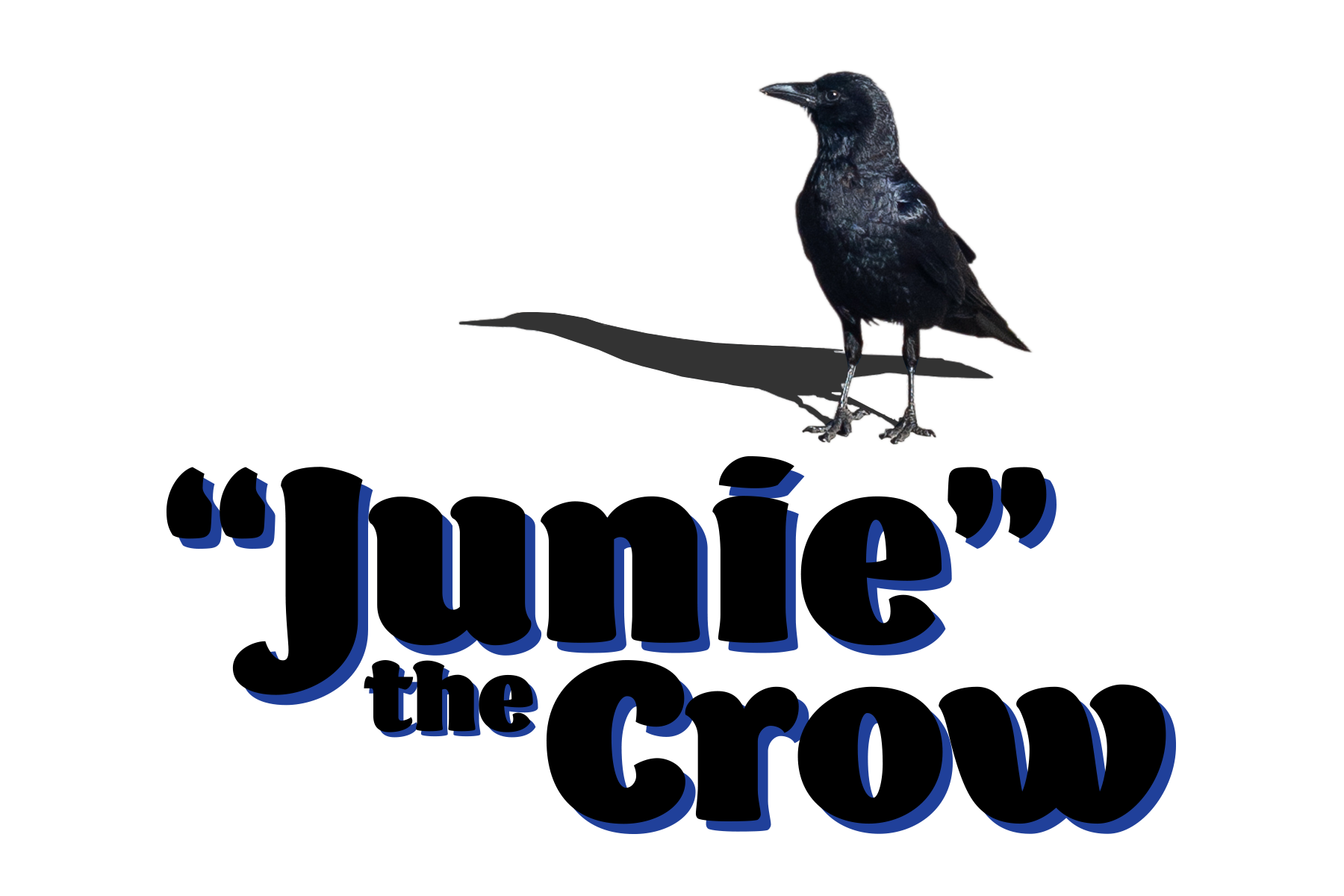
Junie likes the dried papaya. i offer almonds, but Junie knows what Junie likes.

Junie appears to be an American Crow.

Stu is a stud, though his advances are often rebuffed by the lunch crowd. the pigeons eat everything except for the papaya, which works for Junie just fine.

Stu appears to be a Pied Rock Pigeon.

Squirrel comes to eat the larger seeds, harass the pigeons, and somehow always has unshelled peanuts? a scavenger and survivor, through and through.
i believe Squirrel here is a Fox Squirrel.
and there it is, a trip on the tangent highway (which would probably just be off-ramps?). been calling these jaunts tangentiafying – start off in one spot, end up somewhere else. i often feel pulled in a tangential direction and peel away telling myself it’s silly or a waste of time to pursue. not this go-round – i’m rolling with it, baby. seeing where things go…
started on this yesterday and hit a critical point of travel after which abandonment really would mean wasted time. not so! learned the patience of pigeons, used a new typeface – “Barricada Pro” by Elí Castellanos – and enjoyed myself. radical.
i will admit to procrastinating a bit. stalling for time before putting together bigger projects – productively procrastinating. honestly, this feels good. the handkerchief was a bit of the same; providing a gentle re-entry to creative spaces after a couple weeks of going through sh-t – necessary sh-t, but difficult all the same.
feeling better on the other side, free from some hang-ups. getting my feet wet again and dipping my toes into something new, too. tangentiafying.
let’s see where this goes…


a retrospective

visited BAMPFA this past Sunday for Rosie Lee Tompkins: A Retrospective. keeping my photos from the exhibit here for reference and inspiration.


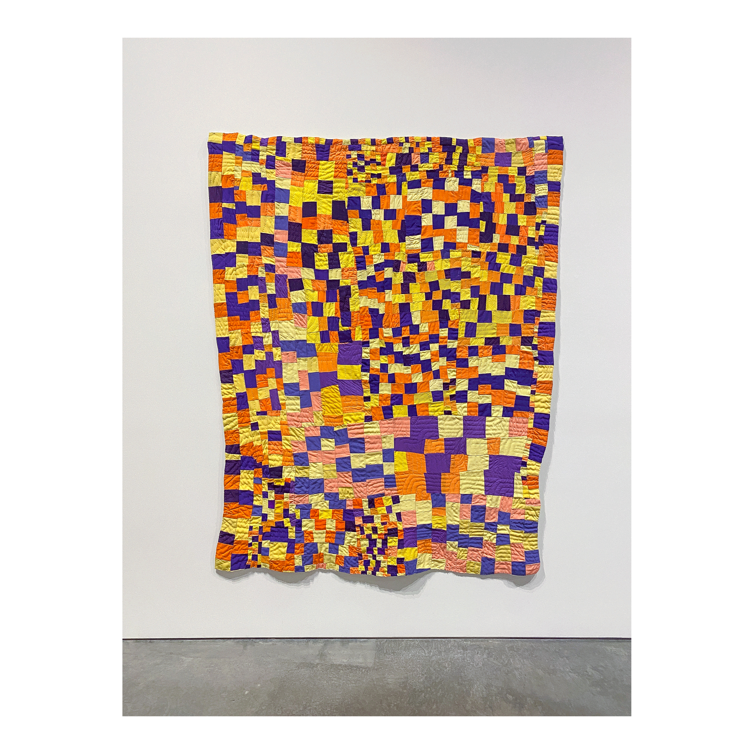


quilts were bequeathed from the estate of collector Eli Leon. i’ve crossed paths with Mr. Leon’s legacy several times in the years before i started earnestly quilting myself and many times since.
endless gratitude to Effie Mae Howard and Eli Leon; and quilters Irene Bankhead, Willia Ette Graham, and Johnnie Wade – thank you.

common assets, vol. 3

one Youtube video usually leads to another, and a revisit to the lexicography video led to this Vox video about the Cooper Black typeface by Oswald Cooper.

while working on the… title card, i’ll call it, for this entry i thought of these logos. have nostalgic sentimentality for both. the Payless logo identity has since gone in a different direction… and Love’s looks Cooper Black inspired – it’s not as round, but there are similarities (it’s in the “o”).

“Gimme Some More” - Busta Rhymes (1998/Elektra Records) directed by Hype Williams
(sample from Bernard Herrmann’s “Psycho” theme)
really dig Busta Rhymes’ music videos from this era. “Put Your Hands Where My Eyes Could See” is another favorite, also directed by Hype Williams.

“The Rain (Supa Dupa Fly)” - Missy Elliott (1997/The Goldmind) directed by Hype Williams
(sample from Anne Peebles’ “I Can’t Stand the Rain”)
Missy Elliott has some of the best music videos, ever. period.
“beep, beep. who got the keys to the Jeep? vrrrrroooooom!” ;-)

“B.O.B.” - Outkast (2000/LaFace-Arista) directed by Dave Meyers
such. a. good. time !!! 808s, off the wall colors, candy painted Cadillacs – what more could you want?

“You’re Makin’ Me High” - Toni Braxton (1996/La Face) directed by Billie Woodruff
love this music video (*ahem* Bryce Wilson *ahem*). ‘Secrets’ and ‘Space Jam’ were the first two CDs in the collection. was probably too young for Toni, but… whatever!

“Fantasy” - Mariah Carey (1995/Columbia)
the inspiration drawn from Mariah Carey and this music video specifically runs deep.

crossed paths with a De Tomaso Pantera last autumn. didn’t recognize it and assumed it was an Italian sports car – and it is, sort of. i’ve since learned more about it, in large part from watching Jay Leno’s Garage.
watched a few more episodes since and some favorites include the 1966 Oldsmobile 442 (love, love, LOVE the “442” enameled nameplate !!!), 1931 Duesenberg Model J LaGrande Coupe (that interior, and rumble seat !!!), 1972 Citroën SM (super neat engineering !!!), and the 1957 Imperial (super sweet, retro detailing !!!). been liking the “pandemic editions” – they feel more intimate. Leno’s knowledge and familiarity with his fleet is impressive, and i appreciate the narrative style of his explanations. wish the jokes would catch up…

meant to include this in vol. 2 and forgot. another Youtube gem – meditative bonsai art by a creator in the UK. this is from the beginning of the video – thought it looked pretty nice to start, and was stunned by the result. carefully meticulous and fascinating process.

lex·i·con

used “acerbic” the other day without confidently knowing its meaning, which is:
acer•bic \ə-ˈsər-bik, a-\ adj (1865) : acid in temper, mood, or tone < ~ commentary> <an ~ reviewer> — acer•bi•cal•ly \-bi-k(ə-)lē\ adv
still need to consciously re-direct to the desktop dictionary rather than a dictionary on the desktop. the ease and convenience of technology is nearly irresistible, sure; but things stick better for me when using a physical reference. still, many Google sourced definitions have been recorded in sketchbooks that have since been tucked away. pulling some of those notes out to keep here, for visibility sake.

abbreviated and scattershot post-it note definitions – mostly using Google, which references ‘The Oxford American College Dictionary’. used to text Google “define such-and-such” from my flip phone back in the T9 days for vocabulary on the go.
researched dictionary options before buying. this Slate article offers helpful user perspective, and this Youtube video featuring lexicographer Kory Stamper has cool info too. in the end, went with Merriam Webster’s Collegiate Dictionary. i appreciate their descriptivist philosophy; and it was the kind i had as a kid – that definitely counts for something.
reached for the dictionary again the other day to look up “sardonic”. by that point i’d already started documenting and scanning the sketchbook definitions. wasn’t until a few pages in that i realized i’d already recorded a definition. the previous came from Google – here’s Merriam Webster’s take:
sar•don•ic \sär-ˈdä-nik\ adj [F sardonique, fr. Gk sardonios] (1638) : disdainfully or skeptically humorous : derisively mocking <a ~ comment> syn see SARCASTIC – sar•don•i•cal•y \-ni-k-(-ə)lē\ adv

part of the collection of unfamiliar words – definitions provided by ‘Merriam Webster’s’ this time.
while i’m here, the rest of the “pantograph” definition referenced in the chicken scratch thumbnail is:
pan•to•graph \ˈpan-tə-ˌgraf\ n [F pantographe, fr. pant- + -graphe -graph] (1723) 1 : an instrument for copying something (as a map) on a predetermined scale consisting of four light rigid bars jointed in parallelogram form; also : any of various extensible devices of similar construction (as for use as brackets or gates)…
(P.S. – should there every be a need to charm a lexicographer, remember this)

a car for Killface

‘Frisky Dingo’ - (2006/ 70/30 Productions) created by Adam Reed & Matt Thompson

nothing can replace the Annihilatrix or trusty blue minivan, but this 1980 Chevrolet Camero Z28 has Killface written all over it. i mean, come on…


one trick pony

‘Show Pony’ - Orville Peck (2020/Columbia)
came across this album review while looking for liner notes. stopped to read through – appreciate the perspective.
watched the music video for “No Glory in the West” last year, sometime toward the start of the pandemic lockdowns in the states. i liked it, a lot; and then didn’t listen to it again until earlier this year. this song shakes something up in me and is the reason why i picked up guitar again. far beyond wanting, i needed to play this song. so i learned it; and it’s the one song i know how to play front to back – my parlor trick.

‘Ride ‘Em Cowboy’ - Paul Davis (1974/Bang Records) art direction by Eddie Biscoe, embroidery by Michele, photography by Nick Rietz, packaging by James Flournoy Holmes & David “Worm” Holmes for Wonder Graphics
titular track “Ride ‘Em Cowboy” is a standout – “i started in New Mexico, must have been a thousand years ago…”
with country western on the mind it would serve me well to return to a record vaguely mentioned before – one that needed “proper” photos taken.
hadn’t heard of Paul Davis before coming across his album ‘Ride ‘Em Cowboy’. the packaging alone is a home run. embroidered western wear? yes please! the album jacket feels like a shirt with embossed denim and embroidery textures, and “unbuttons” onto a saloon scene with track listings in cowboy lasso type. pulling out the liner reveals another layer: the undershirt and hankie of the denim wearer. really into the visual narrative of this album, and it was only a buck – wins all around.


notes from the editor
changed my mind on a few things that’ve been reflected on here earlier. namely, a couple mixtapes. they were bloated and the sequencing wasn’t dialed in, moving the needle from relief to retribution. didn’t make sense to keep them that way, not if they’re meant to be listened to. these mixtapes were/are for me – my catharsis – so i made some changes. fewer songs, less judgement, and that 80 minute playtime that seemed so serendipitous? turns out, it’s too much. a dozen or so songs, under an hour – that’s more like it.


on another note: i recently thought to myself, “i should re-read books the way i re-watch movies.”
absolutely. yes. do that.
pulled a few from the shelf to re-visit (and a couple to wrap-up).

‘Bless Me, Ultima’ by Rudolfo Anaya, ‘The Air-Conditioned Nightmare’ by Henry Miller, ‘Normal People’ by Sally Rooney, ‘The Wind-Up Bird Chronicle’ and ‘Kafka on the Shore’ by Haruki Murakami.
making these notes in an effort to maintain accountability in my creative process and to encourage curiosity and a perspective that sees change as not only inevitable, but vital. some of this has been difficult to externalize – want to recognize that – and i’m challenging myself (present, and future) to reserve judgement/shame/guilt when it comes to changing my mind. status report: ongoing.
moving on from working on those two mixtapes. several others have come together since, and the process is continuing to evolve.
excited to revisit stories i’ve read before. i think it’ll provide an opportunity to better identify my preferences in literature the way i’ve been able to with music and movies. couldn’t hurt, right?
glimpsed a pair of owls overhead a few evenings ago – Ultima first.